|
Subscriber Sections The
Anals MoGauge © Subscription Help (Login, Password etc.) Free Forums Resources Market Stats and Kitco Thumbnail Charts Bear
Essentials Marketviews with Ike Iossif Prudentbear.com
Humor Wall Street Follies Financial Funnies Hilarious! by stoolie prolerbear Not
In My Backyard for Capitalstool. Support the Stool! |

We
don't know and neither do they.
Chart
Courtesy of
Market
Cycles
Dr. Stool Explains Cycles
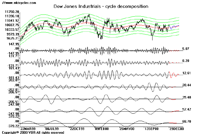
Chart Courtesy of Market Cycles
In this chart, from late December, a cycle which runs about 4.5 months is headed into a top. Longer waves (not shown) are about one year, and two years in length. The numbers on the right in the lower portion of the chart represent the actual average length of shorter cycles, in days. The black line shows the actual cycle up to the end of December. The red line is an extrapolation. Both the longer term and shorter term cyclicality is derived by a mathematical model known as Fourier analysis.
If you are technically oriented, Market Cycles is the best of this type of work that Dr. Stool has seen on the web. Even if you aren't all that technical, the pictures speak for themselves. As you can see, the charts also provide an extrapolation for the next few weeks. Gives you a nice framework to work with. Dr. Stool highly recommends you familiarize yourself with this type of cycle analysis. If you are a trader or market timer, it will help you.
The
work is based on JM Hurst's 1970 classic on cyclicality in
markets, Profit Magic of Stock Transaction Timing
. This
book was one of the keys to sending Dr. Stool on his inexorable
downward spiral into the netherworld of Stock Proctology. By the way,
one of the benefits of reading this book is that when you pay a visit
to Dr. Stool again, you won't have to keep asking yourself, "What
the hell is that lunatic talking about?"
The Market Cycles site is based on a scientific approach, whereas Dr. Stool, places greatest faith in the study of stock proctology. Stock proctology involves the study of the proctological expressions of the majority of Wall Street market strategists. The core of Stock Proctology is that, whatever they say, expect the opposite. There are exceptions, and you must familiarize yourself with those people. This is the true essence of stock proctology. Know Thine Analyst!


